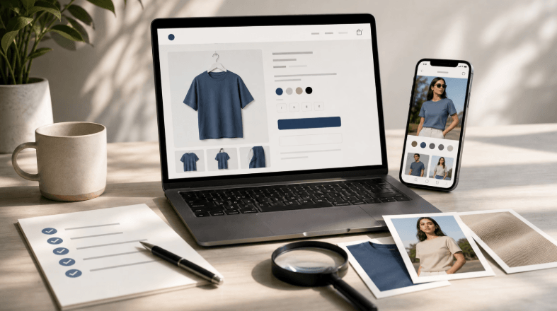
Customers form an impression of a shop long before they reach the counter. They see the signage from the footpath, check the website on their phone and compare the two in their head. When the physical space and the online presence tell the same story, the business feels credible and memorable.
Why consistency counts
A mismatch between a shopfront and a website creates quiet doubt. If the store looks warm and handcrafted but the site is cold and generic, visitors wonder which is the real business. Consistent design signals that the owner has thought carefully about the experience from start to finish.
Consistency also saves effort for customers. When colours, fonts and tone are familiar, people recognise the brand immediately on a street, a receipt, a social post or a search result. That recognition builds trust gradually, and it makes marketing money work harder because every touchpoint reinforces the others.
Start with your brand
Before choosing paint colours or website templates, define what the business stands for. Write a few sentences about who you serve, what you offer and how you want people to feel. These notes become a reference point that guides every design decision, from furniture to the wording on buttons.
Collect examples that capture the feeling you want, such as photographs, colour swatches and samples of materials. Place them together on a single board or folder. Seeing the pieces side by side shows whether they fit together, and it helps you explain your vision to designers and builders.
Retailers planning shop fitouts Nowra should think about brand early, because the fitout locks in materials, lighting and layout that are expensive to change. Sharing your brand notes with the builder and the web designer at the same time keeps both projects heading in the same direction.
Colour and materials
Choose a limited palette and use it everywhere. Two or three main colours, with one accent, is usually enough. Test them in different lighting, since a colour that looks perfect on a screen may appear completely different on a shop wall under warm lights.
Materials carry meaning too. Natural timber suggests warmth and craftsmanship, polished concrete feels modern and industrial, and soft textiles invite people to linger. Echo these qualities online through photography, textures and background treatments, so that the website feels like an extension of the room.
Typography and signage
Fonts speak before words are read. A sharp, geometric typeface feels contemporary, while a serif face suggests tradition. Pick one or two typefaces for the shop and use the same ones on your website and printed material. Avoid mixing too many styles, which looks unplanned and tires the eye.
Signage must be legible from a distance and at a glance. Keep wording short and contrast high. Then check that your website header uses the same logo, spacing and colour treatment. A small difference, such as a slightly different shade of green, can make the two feel unrelated.
Layout and flow
Think about the path a customer takes. In the shop, the entrance draws attention to the most appealing products, then guides people deeper to browse. A website should do something similar, with a clear first screen, obvious navigation and a logical route from interest to purchase or enquiry.
Group products and information in the same way on both. If the shop arranges items by occasion, such as gifts or everyday essentials, consider using the same categories online. Shoppers who move between the two will find the experience easier because they already understand how the business organises things.
Keep calls to action consistent. If the shop invites people to join a loyalty program at the counter, the website should offer the same program with the same name and benefits. Repeating the offer in both places shows that the business is coordinated and reliable.
Finding inspiration
Looking at good examples speeds up decisions. Browsing an Australian css gallery shows how local designers handle layout, colour and typography, and it helps you describe what you like and dislike. Save a few examples that fit your brand and share them with your designer as a starting point.
Visit other shops as well. Notice what makes you feel welcome, where you pause and what you remember afterwards. Photograph details that appeal, such as a display shelf or a clever sign, and think about how the same idea could translate into your own web pages.
Photography and imagery
Use real photographs of your shop on the website. Images of the actual interior, products and staff are more persuasive than stock pictures, and they prepare visitors for what they will see in person. Take photos in good light and show the space as customers will experience it.
Keep a consistent visual style. Similar framing, lighting and colour treatment make a collection of images feel intentional. If you update the shop with new displays or seasonal products, refresh the website pictures at the same time so the two stay aligned.
Mobile and practical details
Most visitors will check your website on a phone, often while standing outside the shop. Make sure opening hours, address, map and phone number appear at the top, and that buttons are large enough to tap easily. A frustrating mobile experience undoes the good impression of a beautiful shopfront.
Keep information accurate. Update holiday hours, new services and changes of address on the website and on map listings straight away. Customers who arrive at a closed door because the site was out of date rarely return, no matter how appealing the shop looks.
Bringing it together at launch
Plan the launch of the shop and the website together. Prepare photos, wording and offers in advance, and use the same message in announcements, social posts and signage. A coordinated launch creates momentum, and it ensures that early customers meet a consistent brand wherever they find you.
After opening, gather feedback. Ask customers what they noticed first and whether the website matched their experience in the shop. Their comments will point to small mismatches that you can fix quickly, and they will show which elements of your design are working best.
Keep refining over time. Brands evolve as businesses grow, and the shopfront and website should evolve together. Review both at least once a year, update what has aged and keep the story consistent. That steady care turns a good first impression into long-term loyalty.